


How Micro-Animations in Custom Designs Turn Visitors into Buyers

Praveen Kumar
Your Website Loads, Nothing Moves, and Your Visitor Is Already Leaving
Open most Indian SMB websites and you'll get the same experience — a flat page, static images, text dumped into sections, and a "Contact Us" button sitting somewhere in the corner doing absolutely nothing to earn a click. The page renders. The visitor glances. The back button gets pressed. Session over.
Now open a site like Razorpay, Zerodha, or Freshworks. Notice how elements ease into the viewport as you scroll. How buttons respond when you hover — a subtle shift in colour, a slight lift. How form fields glow gently when you focus on them. How pricing toggles slide between monthly and annual with a satisfying snap. None of this is accidental. These are micro-animations, and they're doing more conversion work than most landing page copy ever will.
The gap between a website that feels alive and one that feels abandoned isn't massive redesign budgets. It's intentional, performance-optimised motion design built into a custom frontend. And for Indian SMBs spending ₹50,000–5,00,000 on paid ads driving traffic to a static website, this is money left on the floor every single day.
What Micro-Animations Are (And What They Definitely Are Not)
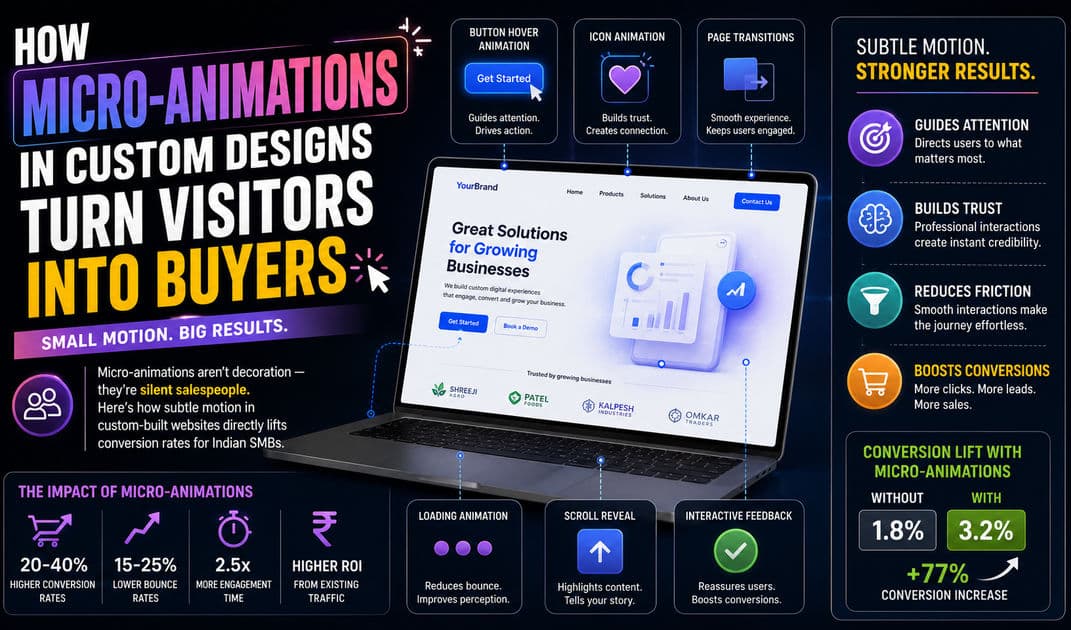
Micro-animations are small, functional motion cues that respond to user action or guide attention during a browsing session. They last 100 to 500 milliseconds. Most users don't consciously register them — and that's the point. They operate on a subconscious level, making an interface feel responsive, intuitive, and trustworthy.
What micro-animations are not: flashy intro sequences, auto-playing video backgrounds, parallax scrolling on every section, or bouncing icons begging for attention. That's decoration. Decoration gets in the way. Micro-animations get out of the way while quietly steering users toward the action you want them to take.
Here's a practical distinction most design agencies in India get wrong:
| Type | What It Does | Impact on Conversion |
|---|---|---|
| Decorative animation | Entertains, impresses on first visit | Zero — often hurts load time and annoys repeat visitors |
| Micro-animation | Guides focus, confirms actions, reduces friction | Directly measurable — higher click-throughs, lower drop-offs |
If your animation exists only to look impressive in a portfolio, it's decoration. If it exists to make your visitor's next action more obvious and more satisfying, it's a micro-animation. One costs you performance. The other earns you conversions.
The Five Micro-Animations That Directly Move Conversion Needles
Not all micro-animations are equal. Some are nice-to-have. Others are directly tied to whether a visitor completes a purchase, submits a form, or bounces. These five are the ones that consistently show up in conversion data.
Button State Feedback
When a user hovers over your "Get a Quote" button and nothing happens — no colour shift, no scale change, no shadow lift — the interface feels dead. The user's subconscious reads it as unresponsive. It creates a microsecond of doubt: "Is this clickable? Will this work?"
A simple hover transition — a 200ms background colour shift combined with a subtle translateY lift of 2 pixels — eliminates that doubt entirely. The button feels alive. It feels clickable. The user's finger (or cursor) commits.
This isn't theoretical. E-commerce studies have consistently shown that interactive button states improve click-through rates by 10–25% over flat, static buttons. For an Indian SMB getting 5,000 monthly visitors, that's the difference between 200 and 250 lead form submissions — from a CSS transition that costs zero additional load time.
Scroll-Triggered Content Reveals
When every section of your page is visible the instant it loads, there's no visual hierarchy. The user's eye scans the entire page without stopping anywhere. Nothing demands attention because everything demands attention equally.
Scroll-triggered reveals — where content fades in or slides up as the user reaches each section — create a reading rhythm. Each section gets its own moment of arrival. The user processes one block before the next one appears. Attention is directed, not scattered.
The key is restraint. Each reveal should be a simple opacity fade combined with a 20–30 pixel upward translate, completing in 300–400 milliseconds. Anything slower feels sluggish. Anything more dramatic — spinning in, bouncing, zooming from the corner — feels amateurish and pulls focus from the content itself.
Form Field Focus Indicators
Forms are where conversions live or die. A lead capture form, a checkout flow, a booking system — these are the money pages. And most Indian SMB websites treat form fields like afterthoughts: plain rectangles with no visual feedback.
When a user clicks into a form field and it responds — a border colour transition, a subtle glow, a floating label that lifts smoothly above the input — the form feels guided. The user knows exactly where they are in the process. They feel like the system is paying attention to them. That feeling of responsiveness reduces form abandonment significantly.
Floating label animations specifically deserve attention. Instead of static placeholder text that disappears when the user starts typing (forcing them to remember what the field was for), a floating label smoothly transitions above the input field. The user always knows what information they're entering. This tiny motion pattern has reduced form error rates across every measurable study of the technique.
Loading and Progress Indicators
Indian internet connections are inconsistent. A user in Surat on a 4G connection might experience a 300ms API response. The same user in a basement office on congested WiFi might wait 3 seconds. If your interface shows nothing during that wait — no spinner, no progress bar, no skeleton screen — the user assumes something broke.
Skeleton loading animations — grey placeholder shapes that pulse gently in the layout where content will appear — tell the user the system is working. They dramatically reduce perceived wait time. A 2-second load with a skeleton screen feels faster than a 1-second load with a blank white page, because the user's brain has something to process instead of staring at nothing and wondering.
For e-commerce checkouts and payment processing — where Indian users are especially anxious about whether their UPI or card payment went through — animated progress steps (a horizontal stepper that fills as each stage completes) reduce payment page abandonment. When users can see "Payment Verified → Order Confirmed → Receipt Generated" progressing smoothly, they stay. When they see a blank screen after clicking "Pay," they panic-refresh and sometimes double-pay.
Cart and Notification Micro-Feedback
When a user adds a product to their cart and the only feedback is the cart count changing from "0" to "1" somewhere in the header, the action doesn't feel confirmed. Did it work? Should they click again?
A brief animation — the cart icon bouncing subtly, a small badge scaling up from zero, a toast notification sliding in from the edge of the screen with a "Added to cart" message — confirms the action immediately. The user doesn't need to check. They know. They move on to the next product or proceed to checkout with confidence.
This same principle applies to any success or error state. Form submitted? A green checkmark that draws itself in real time feels infinitely more reassuring than a static "Thank you" text swap. Payment failed? A red shake animation on the error message draws the eye directly to what went wrong.
The Performance Trap — Where Animations Kill Instead of Convert
Here's where most web agencies in India go wrong. They discover animation libraries — GSAP, Framer Motion, Lottie — and go overboard. Suddenly the homepage has 15 animated sections, every element has an entrance animation, the JavaScript bundle has ballooned by 200KB, and the page takes 4 seconds to become interactive on a ₹12,000 Redmi phone.
Micro-animations must be performance-neutral. That's a non-negotiable design constraint, not a nice-to-have.
CSS Transitions Over JavaScript Where Possible
The majority of effective micro-animations — button hovers, focus states, colour transitions, opacity fades — should be pure CSS. CSS transitions and transforms are GPU-accelerated in modern browsers. They don't block the main thread. They cost virtually zero performance overhead.
The moment you reach for JavaScript to animate something that CSS can handle, you've made a performance mistake. JavaScript animations run on the main thread, competing with your event handlers, API calls, and DOM updates. On mid-range Android devices — which represent the vast majority of Indian mobile users — this competition creates visible jank.
Animate Only Transform and Opacity
This is the golden rule of web animation performance: only animate transform (translate, scale, rotate) and opacity. These two properties are composited by the GPU without triggering layout recalculations or repaints. The moment you animate width, height, margin, padding, top, left, or border — the browser has to recalculate the layout of every affected element on every single frame. On a budget Android device, this turns a smooth animation into a stuttering mess.
Every micro-animation in a production website should pass this test: "Am I only animating transform and opacity?" If the answer is no, redesign the animation.
Respect Reduced Motion Preferences
Roughly 10–15% of users have motion sensitivity — animations can trigger nausea, dizziness, or disorientation. Modern browsers expose a prefers-reduced-motion media query. Any responsibly built website must honour this setting by reducing or disabling animations for users who've requested it.
This isn't optional polish. It's accessibility compliance. And for Indian businesses targeting government contracts or enterprise clients who may require WCAG compliance, ignoring motion preferences can disqualify your platform from consideration.
Why Template Websites Cannot Deliver Effective Micro-Animations
This is the part template-based agencies don't want to talk about. WordPress themes and Shopify templates do include some animations — Elementor has a "fade in" effect, many themes bundle AOS (Animate On Scroll). But these are blunt instruments.
Template animations are one-size-fits-all. The same fade-in-up effect applies to your hero section, your testimonials, your pricing table, and your footer. There's no hierarchy. There's no intentional direction of attention. Every section enters the same way, which means no section feels special.
Worse, template animation libraries are loaded globally. Even if you use a fade effect on three elements, the entire animation library (often 50–100KB of JavaScript) loads on every page. On a custom-built Next.js frontend, you import only what you use. A single CSS transition costs bytes. A full animation library costs kilobytes — and on Indian mobile connections, kilobytes translate directly to seconds of load time.
Custom design gives you surgical control. You decide which elements move, how they move, how fast they move, and when they stop moving. You can A/B test specific animation patterns against conversion goals. You can measure whether your scroll reveal on the pricing section actually increases pricing page engagement or whether it's just delaying the content the user came for. Template websites don't give you that resolution.
Motion Design Is a Conversion Investment, Not a Visual Upgrade
Most Indian SMB founders think about animations the way they think about colour schemes — as aesthetics. Something the designer picks to make things look "modern." This framing fundamentally misunderstands what intentional motion does.
Micro-animations are conversion mechanics. They reduce cognitive friction, confirm user actions, guide visual attention, and build subconscious trust in the interface. A website that uses them well doesn't just look better than a static one — it performs measurably better. Higher click-through rates on CTAs. Lower form abandonment. Reduced bounce rates. Longer session durations.
For an Indian SMB spending ₹1–5 lakh monthly on Google Ads or Meta campaigns, the conversion rate of your landing page is the single biggest lever on your cost per acquisition. A 15% improvement in conversion rate from better UX — including deliberate micro-animation — effectively gives you 15% more leads for the same ad spend. No budget increase needed. Just a smarter frontend.
If your current website feels flat, static, and forgettable — it's not just a design problem. It's a revenue problem. And it's fixable without a full rebuild, if you work with a team that understands where motion matters and where it doesn't.
Published by APXTECK — Custom web development and AI automation for Indian SMBs. apxteck.com/services
Article Comments
You must be signed in to post comments.
Sign In to Join the Discussion →No comments approved yet. Be the first to share your thoughts!
About the Author

Praveen Kumar
Co-Founder & DirectorFull-Stack Developer, APXTECK, chatgpt, google
Praveen Kumar is the Co-Founder and Full-Stack Developer at APXTECK, an AI-powered IT agency helping Indian SMBs grow through web development, automation, and AI integration. He builds production-grade systems using Node.js, Next.js, PostgreSQL, and modern AI APIs. When he is not shipping code, he is writing about practical technology that actually works for Indian businesses.
Related Insights

Secret Psychology Behind High-Converting Coaching Interfaces

How Node.js Development Empowers SMBs in Maharashtra

The SMB Guide to Scaling Down Enterprise Tech on a Budget

How Business Automation Saves 20+ Hours of Manual Work Weekly
Why Traditional SEO Is Dead: Preparing for Generative Search

Next.js ISR: The Real Weapon for Better Search Rankings

How to Architect a Multi-Tenant SaaS That Actually Scales