


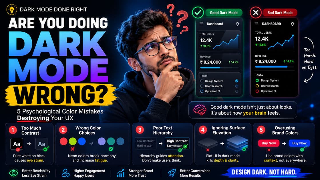
Are You Doing Dark Mode Wrong? 5 Psychological Color Mistakes Destroying Your UX

Praveen Kumar
Your Dark Mode Isn't a Feature — It's a Liability
Here's a test. Open your app's dark mode right now on your phone. Stare at it for 90 seconds. Then switch to WhatsApp or Zerodha — apps whose dark modes feel effortless. Notice the difference? That slight discomfort, that vague sense that something is "off" about your UI — that's not your imagination. That's bad color psychology at work.
Dark mode has gone from a nice-to-have toggle to a baseline user expectation. Over 80% of smartphone users globally prefer dark mode, and in India — where AMOLED screens dominate the mid-range Android market (Samsung Galaxy M series, Realme, OnePlus Nord) — dark mode isn't just a preference, it's practically the default viewing experience. Yet most Indian dev teams treat dark mode implementation as an afterthought: invert the colors, swap the background to #000000, crank the text to #FFFFFF, and ship it.
The result? A dark theme that technically exists but actively hurts the user experience. And the worst part is that the damage is invisible in your analytics — users don't complain about eye strain or cognitive fatigue. They just leave.
Let's break down the five most common psychological color mistakes in dark mode — and what to do instead.
Mistake 1: Pure Black Backgrounds With Pure White Text
This is the most widespread dark mode sin, and almost every first-attempt implementation commits it. Setting your background to #000000 and your text to #FFFFFF creates maximum contrast — a 21:1 ratio. That sounds like a good thing until you understand how the human eye actually processes contrast.
Why Maximum Contrast Backfires
The human eye doesn't work like a monitor calibration tool. When you place bright white text on a pure black surface, the high luminance difference causes a phenomenon called halation — the white text appears to bleed or glow into the dark background, especially for users with astigmatism (which affects roughly 30-40% of people). The letters look fuzzy, vibrating, almost unstable. Reading long-form content in this state causes eye fatigue within minutes.
This is basic visual neuroscience: your iris has to work harder to constantly adjust between extreme brightness values. It's the same reason staring at headlights on a dark highway is painful — your eyes can't comfortably process extreme luminance jumps.
What the Best Dark Modes Actually Do
Look at the apps that get dark mode right — YouTube, Spotify, Twitter/X, Slack. None of them use pure black backgrounds. They use elevated dark grays.
| App | Background Color | Text Color | Approximate Contrast Ratio |
|---|---|---|---|
| YouTube (Dark) | #0F0F0F | #F1F1F1 | ~18:1 |
| Spotify | #121212 | #B3B3B3 (secondary) / #FFFFFF (primary) | ~13:1 / ~17:1 |
| Slack (Dark) | #1A1D21 | #D1D2D3 | ~11:1 |
| Twitter/X (Dim) | #15202B | #E7E9EA | ~14:1 |
| Most Indian apps | #000000 | #FFFFFF | 21:1 (too harsh) |
The sweet spot for dark mode contrast sits between 11:1 and 15.5:1 for body text. That's still well above the WCAG AA minimum of 4.5:1, but it eliminates the halation effect and lets users read comfortably for extended sessions.
The fix: Use #121212 to #1A1A2E for backgrounds and #E0E0E0 to #ECECEC for body text. Save pure white for headings and primary CTAs only — places where a brief brightness spike serves a purpose.
Mistake 2: Ignoring Chromatic Adaptation in Your Accent Colors
Here's something most frontend developers never think about: the same accent color looks psychologically different on a dark background versus a light one. That bright blue button (#2196F3) that looks professional and trustworthy on a white background? On a dark background, it screams at the user. It looks aggressive, oversaturated, and cheap.
How Dark Backgrounds Amplify Perceived Saturation
Your brain doesn't process color in isolation — it processes color relative to its surroundings. This is called simultaneous contrast, and it's one of the foundational principles of color perception. Against a dark surface, saturated colors appear more vivid, more intense, and more demanding of attention than they actually are.
This means your entire accent palette — buttons, links, badges, status indicators, notification dots — needs to be recalibrated for dark mode. Not just swapped, recalibrated.
The Desaturation Rule
Reduce saturation by 15-25% and increase lightness by 5-10% for all accent colors in dark mode. The goal is perceptual consistency — the button should feel the same level of "prominent" in both themes, even if the hex values are different.
| Element | Light Mode Color | Dark Mode Color (Corrected) |
|---|---|---|
| Primary Button | #1976D2 (saturated blue) | #64B5F6 (desaturated, lighter blue) |
| Error State | #D32F2F (deep red) | #EF9A9A (softened, lighter red) |
| Success State | #388E3C (strong green) | #81C784 (muted, lighter green) |
| Warning | #F57C00 (intense orange) | #FFB74D (softened orange) |
Google's Material Design 3 system gets this exactly right — they use "tonal palettes" where dark mode variants are pulled from the same color family but sit at a different lightness and saturation level. If you're building with Tailwind, this means maintaining separate color tokens for each theme, not just toggling dark:bg-gray-900 and calling it done.
Mistake 3: Flat Elevation — Treating Dark Mode as a 2D Surface
In light mode, you create visual hierarchy through shadows. A card floats above the background because of a subtle box-shadow. A modal appears elevated because of a darker overlay behind it. Shadows are your primary depth cue.
In dark mode, shadows are almost invisible. A shadow on a dark background is just... darker dark. Your brain can't parse it. And yet, most developers keep the same shadow-based elevation system in dark mode, resulting in a flat, lifeless UI where every element sits at the same perceived depth.
Why This Matters Psychologically
Visual hierarchy isn't decorative — it's cognitive. Your brain uses depth cues to prioritize information. "This card is floating above that surface, so it's more important." "This modal is in front of everything, so I should deal with it first." When dark mode flattens all depth cues, users have to work harder to figure out what's important, what's interactive, and what's background noise.
This increases cognitive load — the mental effort required to use your interface. Higher cognitive load means slower decisions, more errors, and more fatigue. Users won't articulate this; they'll just feel that your app is "harder to use" at night.
The Surface Elevation Fix
Replace shadow-based hierarchy with surface brightness hierarchy. In dark mode, higher elevation equals lighter surface color. This is how Material Design handles it, and it works because it maps to a real-world mental model: things closer to a light source are brighter.
| Elevation Level | Purpose | Surface Color |
|---|---|---|
| Level 0 (Base) | Page background | #121212 |
| Level 1 | Cards, sidebars | #1E1E1E |
| Level 2 | Dialogs, dropdowns | #232323 |
| Level 3 | Tooltips, popovers | #2C2C2C |
| Level 4 | Modals, top sheets | #333333 |
Each step is a small, intentional lightness increase — roughly 5-8% more luminance per level. This gives users a clear, subconscious hierarchy without relying on shadows that don't render well on dark surfaces.
Mistake 4: Neglecting the Blue Light Warmth Shift
Most dark mode implementations keep the same color temperature as light mode. This is a mistake rooted in ignoring why users enable dark mode in the first place.
The Primary Use Case Is Nighttime
The majority of dark mode usage happens in low-light environments — in bed, at night, during evening commutes on the Metro. Users switch to dark mode because bright screens are uncomfortable in the dark. But if your dark mode still leans cool (bluish whites, stark grays, electric blue accents), you're only solving half the problem.
Blue-wavelength light suppresses melatonin production and signals "daytime" to the brain. This is well-documented sleep science. Cool-toned dark modes are gentler than bright white light modes, sure — but they're still fighting the user's biology at the exact moment the user is trying to wind down.
How to Apply a Warm Shift Without Looking "Sepia"
You don't need to turn your app into a Kindle nightlight. A subtle warm shift is enough. Nudge your dark background grays from pure neutral toward a very slight warm undertone.
Instead of #121212 (neutral), try #141210 (barely warm) or #171614 (warm gray). For text, instead of #E0E0E0 (cool gray), try #E0DDD8 (warm off-white). The difference is almost invisible in a side-by-side screenshot but absolutely noticeable over a 30-minute reading session. Users will feel that your app is "easier on the eyes" without being able to pinpoint why.
The key is subtlety. If a non-designer can look at your dark mode and say "that looks yellowish," you've gone too far. The warmth should be felt, not seen.
Mistake 5: Using Color as the Only Differentiator for States
This mistake isn't unique to dark mode, but dark mode makes it catastrophic. In light mode, using red for errors, green for success, and orange for warnings works reasonably well because the broad luminance range gives each color enough room to be distinct. In dark mode, the compressed luminance range makes these colors far harder to distinguish — especially for the 8% of men (and about 0.5% of women) who have some form of color vision deficiency.
The Dark Mode Color Blindness Problem
On a dark background, red and green — the two most commonly confused colors for people with deuteranopia or protanopia — look even more similar than they do on white. The reduced surrounding luminance strips away the brightness cues that partially compensated for hue confusion in light mode.
This means your form validation, status badges, notification types, and data visualizations might be completely illegible to a significant chunk of your user base in dark mode.
Fix: Layer Shape, Icon, and Position With Color
Every state communicated through color should also be communicated through at least one additional channel.
Error states should combine the softened red with a warning icon (triangle, exclamation) and position the error message directly adjacent to the problematic field — not at the top of a form where it loses spatial association.
Success states should pair the muted green with a checkmark icon and, ideally, a brief text confirmation ("Payment received" rather than just a green dot).
Status badges should use shape variation alongside color — a filled circle for active, an outlined circle for pending, a dash for inactive. Even without perceiving the color difference, users can read the shape.
This isn't just accessibility compliance. It's better UX for everyone. Users in bright sunlight (where screen colors wash out), users with aging eyes, users glancing quickly at a dashboard — they all benefit from redundant state encoding.
The Real Cost of Getting Dark Mode Wrong
Indian SaaS companies and product teams often treat dark mode as a cosmetic feature — something the frontend intern implements in a Friday sprint. That's a ₹10-15 lakh mistake when you factor in the downstream effects.
Users who experience eye strain, cognitive fatigue, or subtle readability issues don't file bug reports. They reduce session length. They switch to a competitor whose dark mode "just feels better." They use your product less at night — which, for many Indian users checking apps after work hours, means they use your product less, period.
The fix isn't complicated. It's five specific adjustments: soften your contrast, desaturate your accents, build surface-based elevation, warm your color temperature slightly, and layer your state indicators. None of these require a redesign. All of them can be implemented in a focused sprint with CSS custom properties and a design token system.
Dark mode isn't a toggle. It's a second design system. Treat it like one.
Build Products That Feel Right — Day and Night
At APXTECK, we build web applications and SaaS interfaces where dark mode isn't an afterthought — it's a first-class design decision backed by color science, accessibility standards, and real user behavior data from Indian markets. If your product's dark mode feels "off" and you can't figure out why, we can audit your UI and fix it.
Published by APXTECK — AI-powered web development and UX engineering for Indian businesses. apxteck.com/contact
Article Comments
You must be signed in to post comments.
Sign In to Join the Discussion →No comments approved yet. Be the first to share your thoughts!
About the Author

Praveen Kumar
Co-Founder & DirectorFull-Stack Developer, APXTECK
Praveen Kumar is the Co-Founder and Full-Stack Developer at APXTECK, an AI-powered IT agency helping Indian SMBs grow through web development, automation, and AI integration. He builds production-grade systems using Node.js, Next.js, PostgreSQL, and modern AI APIs. When he is not shipping code, he is writing about practical technology that actually works for Indian businesses.
Related Insights

Why Uber Burned Its Yearly AI Budget in Only Four Months

Lightning-Fast Websites with Premier Next.js Development

Claude Code Loops Explained: Why Prompts Alone Won't Cut It

MCP Servers Are the Biggest Developer Productivity Shift of 2026

I Mastered Claude So You Don't Have To (Beginner to Advanced)

Claude Tag Makes AI a Teammate. That's the Trap.

Vibe Coding Is a Trap (Escape Before It's Too Late)